 There was a recent Top Ten Tuesday topic on book covers which I would have liked to have participated in but already had another post scheduled for the same day. Better late than never, though, so for this month’s Historical Musings post I thought it would be fun to look at some of the various types of covers which tend to be used for historical fiction novels. There are only seven on my list rather than ten, but you will probably be able to think of more.
The ‘faceless woman in a pretty dress’ cover
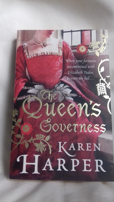
Example: The Queen’s Governess by Karen Harper
I didn’t have to look very hard to find some of these covers on my shelves! This design has become very popular in recent years and although there are some variations – sometimes we can see part of the face and sometimes we can see only the back of the head – the overall effect is the same. I have read that a lot of publishers like to use these covers because obscuring the woman’s face creates mystery and avoids the problem of readers complaining that her appearance doesn’t correspond to the author’s descriptions. However, this type of cover is usually associated with light, romance-focused historical fiction and, depending on reading tastes, might put some people off; there are exceptions, of course, so it’s not always fair to judge. As a separate issue, there’s the question of whether the dress is appropriate to the time period – I won’t go into that here, but you may be interested in this list of anachronistic covers on Goodreads.
The ‘swords and shields’ cover

Example: Insurrection by Robyn Young
These have the opposite effect to the previous type of cover, I suppose. When I see a cover with a shield, sword, helmet, flag or something similar, I expect the story to be action-packed with lots of battle scenes, not much romance and probably a male protagonist rather than female. Again, there are exceptions, but in general these novels have a very different feel from the headless women novels and will often appeal to different readers (although there are plenty of examples of both that I’ve enjoyed).
The distant lands cover
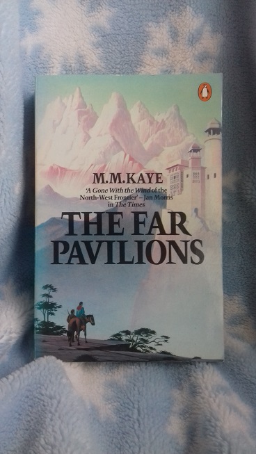
Example: The Far Pavilions by M.M. Kaye
Many historical fiction novels have a strong sense of place as well as of time, and sometimes the publisher will choose to use that as the selling point for the book. One of my favourite historical fiction novels, The Far Pavilions, wouldn’t have worked if it had been set anywhere other than India and Afghanistan, hence the picture and the quote on the cover of my edition – “A Gone With the Wind of the North-West Frontier”.
The tie-in cover

Example: North and South by John Jakes
These are my least favourite types of cover, particularly if I haven’t already watched the adaptation in question. I prefer to form my own visual impression of the characters as I read, rather than have somebody else’s interpretation already in my head before I start, and I like other readers to be given that opportunity too. (I did love both the book and mini-series versions of John Jakes’ North and South trilogy, though, and must read/watch them again one day!) Tie-in covers are not specific to historical fiction, of course, and occur across all genres; although I don’t like them, I can understand the reasons behind their use. Here’s an interesting article from the Guardian.
The illustrated cover
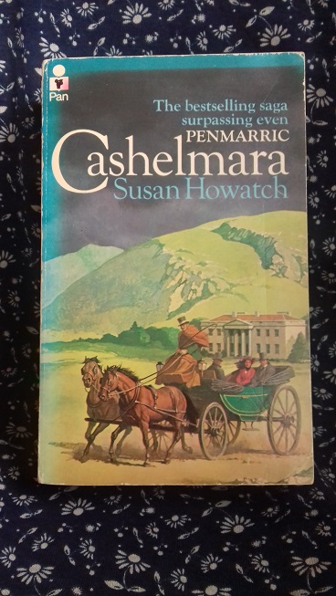
Example: Cashelmara by Susan Howatch
This could overlap with some of the other sorts of cover listed above, but I thought I would still include it (and it gives me a chance to mention another book which is on my must-reread-soon list, along with some of Susan Howatch’s others). Do you prefer books with old-fashioned illustrations on the cover rather than the stock photographs and images that are more popular these days? What about covers with portraits or reproductions of famous paintings (like Girl With a Pearl Earring)?
The ‘what were they thinking?’ cover

Example: Lion of Alnwick by Carol Wensby-Scott
Not too much to say about this one, other than that whoever designs the covers sometimes doesn’t get it quite right. I thought Lion of Alnwick was a good book which deserved a much nicer cover!
The simple but striking cover
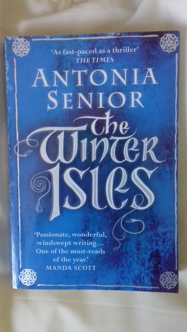
Example: The Winter Isles by Antonia Senior
Sometimes a publisher will avoid all of the above options and go with something basic and neutral. This makes it difficult to judge the book by the cover and to decide at a glance whether it’s something you want to read or not, but the advantage is that it’s not immediately off-putting to readers. (If you’re wondering, I’m reading The Winter Isles now, so haven’t posted my thoughts yet!)
~
What do you think of the covers pictured above? Would they make you more or less likely to pick up the book?

Ooh, covers, one of my favourite topics for a rant! Long, long ago, I was told by my then publisher that unless you were a world-famous author, you had no say – basically, you cried all the way to the bank. That didn’t turn out to be quite true, not in the UK anyway. For instance, the paperback cover of ‘Alathea’ originally had a dark-haired girl on the cover. Since much was made in the book of her being blonde, I was able to get it changed. The American ones, however, were a nightmare. ‘The Moon in the Water’, set in the 17th century, had a knight in crusader armour on the cover. You’d think someone might have said helpfully, ‘Think of the Pilgrim Fathers,’ but no. ‘The Chains of Fate’ had, yes, a knight in crusader armour on the cover. And the cover of ‘Alathea’ (spelled ‘Alethea’ in the US), also set in the 17th century, and in which the heroine spends most of the story vowing never to marry, depicted a Victorian wedding complete with cutesy children and a shower of pink roses.
Well, at least it always got a laugh at the author talks I did.
Nor am I the only historical fiction author to suffer. Just check out the early paperback editions of Dorothy Dunnett’s ‘Lymond’ series. They’re so dreadful that when I read them in public, I used to put a newspaper round the outside so people couldn’t see.
I thought you might be able to provide some insight into this topic, Pam! How frustrating that the American publisher couldn’t even get the time periods right, but at least you had some success in the UK with Alathea’s hair. And yes, you’re definitely in good company! I’ve seen some of those early Lymond covers and they look absolutely awful. In a way, I’m lucky that I came to Lymond relatively recently and bought the Vintage editions which I don’t feel the need to disguise. 🙂
But anyway, I was looking at the covers you’ve shown above, and it struck me how much fashion plays a part. At the moment, it’s the ‘headless woman in fancy dress’ design. At least the ‘Far Pavilions’ cover is fairly evocative and innocuous – you’re pretty sure what lies inside. But the worst by far are ‘bodice ripper’ covers – I’m thinking of Katherine Woodiwiss’s books. People thought you could not only judge a book by the cover, but the person reading it by the cover as well. Bulging boobs, tousled hair, that ‘I’ve just been molested but I enjoyed it’ look – yuk!
The covers I like best are the most decorative ones. ‘The Essex Serpent’ has probably the most gorgeous cover of the last decade, and I’ve seen quite a few others of the same ilk. I also love the cover of ‘The Miniaturist’. Shame about the inside of it!
Oh, I hate the bodice ripper covers – and I would definitely want to wrap a newspaper round one of those. 🙂 There are some beautiful, creative covers around at the moment, though. I agree with you on both The Essex Serpent and The Miniaturist.
I used to think I took no notice of the cover when deciding what to read – but now I know I am influenced by the cover. For example I think carefully about reading a book with a headless woman on the front. I don’t like the ‘tie-in’ covers at all, for the same reasons as you and would prefer to find a copy with a better cover. I do like the illustrated covers like the Cashelmara book, which I also own and still have somewhere (I hope) and I like the art reproduction covers too. The Far Pavilions is one of my favourite historical fiction novels too and I do find that cover and others like it attractive. But if I really wanted to read a book I wouldn’t let the cover put me off.
I wouldn’t be put off by the cover either if I really wanted to read a book, especially if it had been recommended to me or I’d heard good things about it. I’m more likely to be influenced by covers when I’m browsing in the library and know nothing about the books on the shelf.
Ooh, I have that copy of The Far Pavilions! It was a Christmas gift and I still haven’t started it, but all the good comments make me want to move it up the TBR pile (of course I got three new books for Mother’s Day!). I totally agree about the anachronistic covers, they make me nuts. Penguin and Virago do this sometimes, but it doesn’t bother me nearly as much because they tend to be beautiful art reproductions so I let it slide.
I also love the distant lands, but I avoid the movie/TV tie-ins like the plague. I think the only one I own is Bleak House which has Gillian Anderson as Lady Dedlock. It was a wonderful adaptation so I’ll allow it!
I don’t mind the tie-in covers as much if it’s an adaptation I’ve watched and enjoyed, but otherwise I try to avoid them too. And yes, I would recommend moving The Far Pavilions up the TBR – I love it and have read it several times over the years.
Tie-in covers tend to turn me off to the book, especially when the hair and makeup don’t match the period. Which is most of the time. I always wonder if the contents of the book are the original novel, or if it’s been edited to go with the TV/movie better. I prefer either plain covers or illustrated ones like you provide. I really dislike ‘faceless woman in pretty dress’. And if the cover has a dude without a shirt, his pants barely staying on, with an unnaturally ripped build, I pass on by. Bonus ‘no thanks’ points if the dude doesn’t have a face.
‘Faceless man without shirt’ covers! I forgot about those when I was putting this post together. Of course, I don’t have any on my shelves. 🙂
I’ve enjoyed and laughed with some of the comments above. In general, I don’t judge a book by the cover, but if I like the cover, I pick it up and read the synopsis in the back; that is ultimately the deciding factor for my purchase.
I, too, avoid tie-in covers; I prefer original artwork. I don’t mind the faceless females so over abundant in historical fiction; I rather like those covers, particularly if the dresses are striking and in bold colors. I don’t read many books with distant lands covers, but I fancy those. The shields I like; I guess I interpret them as royally related. What I go nuts for is books with gilded leaf borders. It’s a weakness, but I only own two or three of those.
I don’t personally mind the faceless women covers either, but I wish they weren’t used so often because I know a lot of readers are put off by them. Like you, though, I don’t judge solely by the cover anyway – I’m more interested in the synopsis, whether I’ve heard anything positive about the book, read good reviews etc.
The neutral would probably help me – I hate the modern, bodice ripper type covers and the cliched ones. The MM Kaye one is quite nice though!
I like neutral covers too – they can still be quite eye-catching and attractive.
Covers are fascinating. Like you, I also hate the covers based on movies or series, they are usually cheesy, very sloppy.
I run when I see covers like those with epoch dressed headless women! lol. But once, because of my local bookclub, I read a book with an atrocious cover (actually, I bought the book for cheap and listened to it in audio, and the audio had an even atrocious-er cover), but it was pretty good.
I admit many current books don’t appeal to me, and their covers don’t make it more appealing. But, if a fellow reader tells me something that resonates with me, I can totally read it no matter the slaughtered cover.
I like to think that I don’t judge by the cover too much, and that I take other factors into consideration as well, but it’s difficult if a book has a really atrocious cover! But yes, if a reader whose opinions I trust recommends a book to me, I would be prepared to ignore the cover too.
I am most likely to be drawn to the simple but striking cover, however I do rather like the faceless women covers too…mainly because I love a pretty dress 😀
I think the simple covers are often the nicest – and they have the advantage that they shouldn’t put people off. And yes, some of those dresses are really pretty. 🙂
On the basis of the covers alone, my pick would be The Far Pavilions, closely followed by Insurrection – the first one promises me exotic places, and the second suggests royalty or at least aristocracy, and that usually means politics of some description. I’d be put off by the headless woman – suggests romance – and the movie tie-in – I might get the book but I’d try to get a different version. The designer of Lion of Alnwick should be put in the stocks and splatted with rotten tomatoes…
The cover of Lion of Alnwick is horrible, isn’t it? I don’t know what’s going on with the woman’s hair. It’s a shame because the book itself wasn’t bad! But yes, The Far Pavilions is my favourite of the covers I’ve pictured here.
Nice post! Fun topic. I don’t like the tie-in covers either, although sometimes you can’t avoid them. I think I’m most leery of the faceless woman covers, although I probably wouldn’t pick up a what were they thinking cover at all.
I would probably only pick up a ‘what were they thinking’ cover if I already knew something about the book and wanted to read it anyway. I might not want to be seen reading it in public, though. 🙂
😀
My first thought was of the awful Dorothy Dunnett covers. Georgette Heyer’s books have also had some pretty bad ones – anachronistic, and some fluffy ones that had nothing to do with the story.
I don’t mind the “headless dress” ones, or the “sword & shield” ones. I do tend to avoid the movie/TV tie-ins. I think I had that same edition of North & South, back when I didn’t mind as much, and I haven’t re-read it in years either.
Yes, there are some awful Dunnett and Heyer covers. They both deserved better and it’s a shame if people have been put off reading their books because of them. I must re-read North and South one day! I used to get so much enjoyment from re-reading, but just don’t do enough of it these days.
I enjoyed this post and the comments; there’s a benefit to coming late to the party! Seeing The Far Pavilions took me straight back – sadly I no longer have my copy but that was the cover. I too, strongly dislike the tie-in covers, regardless of my views on the film/series if I’ve watched it. I’m not keen on the sword and shield covers either, now I’m seeing them alongside other which hold more appeal for me. The one that leapt out though, was the simple but striking cover. Looking forward to your review on that book, Helen!
Sometimes simple is best! I’m enjoying The Winter Isles so far – my review should be ready in a week or so. 🙂
Wow, we all have a lot to say about covers! The main thing I watch out for are covers that make it plain the book is simply a romance set in another time. The Far Pavilions was a big fav of mine back in the day and I did think the cover let me know we would be traveling. And I completely agree with the cover of The Essex Serpent making me decide to read it! Maybe you will hear from a book cover designer!
That would be interesting – and hopefully I wouldn’t have offended them! I do think most book covers look great, although some designs are overused and some are just not representative of the story. I haven’t read The Essex Serpent yet, but I loved the cover as soon as I saw it and am sure I’ll read it eventually.
Love this topic! I think we are actually living in a golden age of cover design — although there are still some clunkers out there, there’s also so much brilliant work and overall the standards are much higher than in certain eras of the past, especially for mass-market paperbacks.
It’s annoying when some trends get out of control, like the headless woman one…a variation of which is “dress from behind” which also allows display of the clothing without specifying the woman’s face. It was a clever idea the first few times but now it’s getting tiresome.
Your “Simple but striking” category I would say also shows how typography alone can be used to set the tone of the cover, which is another method I find fascinating. Skilled typography can be as expressive as illustration.
Yes, the typography really makes that blue and white cover stand out, doesn’t it? I agree that there are a lot of great cover designs around at the moment, especially when you compare them with some of the awful mass-market covers from the 70s and 80s. I just wish the headless woman and its variations would be used less often!
I’m drawn by the period novels with period paintings, as the Girl with a Pearl Earring, and by covers that indicate travel, with evocative backgrounds, with or without a faceless woman, as in The Far Pavilions, and recently Lucinda Riley’s Seven Sisters series. Interesting topic.
I like the covers that suggest travel too. Lucinda Riley’s books have some very pretty covers – I’m looking forward to the next one in the Seven Sisters series.
Hahah. Your post made me laugh! Especially the what-were-they-thinking example. Well, I don’t think any of these would exactly make me want to pick up the book and read it. But if I had to choose, it would be the Susan Howatch or the M.M. Kaye because I remember both books on my grandmother’s shelves, so there is that. The first one is the least appealing to me(!), even more so than the John Jakes, which is saying something.
It seems that a lot of people find the faceless woman covers particularly unappealing. They obviously sell well, though, as they’re such a popular choice for publishers. I’m glad the what-were-they-thinking-cover made you laugh! I bought that book because I had read some good reviews and I did enjoy it, but wouldn’t have chosen it based solely on the cover.