There was a recent Top Ten Tuesday topic on book covers which I would have liked to have participated in but already had another post scheduled for the same day. Better late than never, though, so for this month’s Historical Musings post I thought it would be fun to look at some of the various types of covers which tend to be used for historical fiction novels. There are only seven on my list rather than ten, but you will probably be able to think of more.
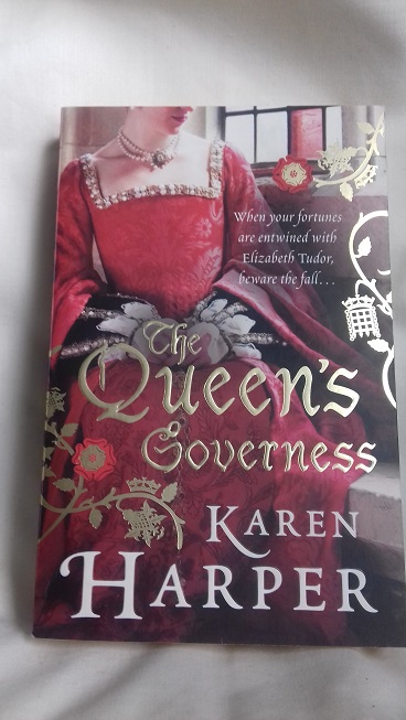
The ‘faceless woman in a pretty dress’ cover

Example: The Queen’s Governess by Karen Harper
I didn’t have to look very hard to find some of these covers on my shelves! This design has become very popular in recent years and although there are some variations – sometimes we can see part of the face and sometimes we can see only the back of the head – the overall effect is the same. I have read that a lot of publishers like to use these covers because obscuring the woman’s face creates mystery and avoids the problem of readers complaining that her appearance doesn’t correspond to the author’s descriptions. However, this type of cover is usually associated with light, romance-focused historical fiction and, depending on reading tastes, might put some people off; there are exceptions, of course, so it’s not always fair to judge. As a separate issue, there’s the question of whether the dress is appropriate to the time period – I won’t go into that here, but you may be interested in this list of anachronistic covers on Goodreads.
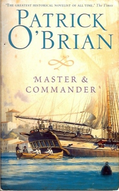
The ‘swords and shields’ cover

Example: Insurrection by Robyn Young
These have the opposite effect to the previous type of cover, I suppose. When I see a cover with a shield, sword, helmet, flag or something similar, I expect the story to be action-packed with lots of battle scenes, not much romance and probably a male protagonist rather than female. Again, there are exceptions, but in general these novels have a very different feel from the headless women novels and will often appeal to different readers (although there are plenty of examples of both that I’ve enjoyed).
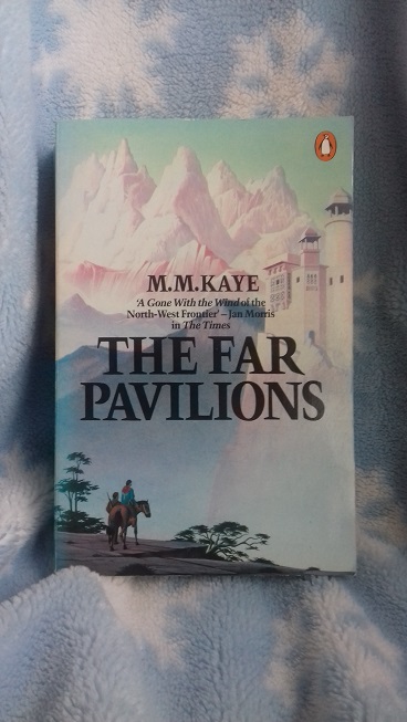
The distant lands cover

Example: The Far Pavilions by M.M. Kaye
Many historical fiction novels have a strong sense of place as well as of time, and sometimes the publisher will choose to use that as the selling point for the book. One of my favourite historical fiction novels, The Far Pavilions, wouldn’t have worked if it had been set anywhere other than India and Afghanistan, hence the picture and the quote on the cover of my edition – “A Gone With the Wind of the North-West Frontier”.
The tie-in cover

Example: North and South by John Jakes
These are my least favourite types of cover, particularly if I haven’t already watched the adaptation in question. I prefer to form my own visual impression of the characters as I read, rather than have somebody else’s interpretation already in my head before I start, and I like other readers to be given that opportunity too. (I did love both the book and mini-series versions of John Jakes’ North and South trilogy, though, and must read/watch them again one day!) Tie-in covers are not specific to historical fiction, of course, and occur across all genres; although I don’t like them, I can understand the reasons behind their use. Here’s an interesting article from the Guardian.
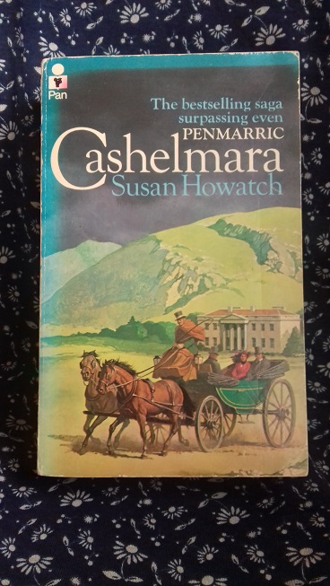
The illustrated cover

Example: Cashelmara by Susan Howatch
This could overlap with some of the other sorts of cover listed above, but I thought I would still include it (and it gives me a chance to mention another book which is on my must-reread-soon list, along with some of Susan Howatch’s others). Do you prefer books with old-fashioned illustrations on the cover rather than the stock photographs and images that are more popular these days? What about covers with portraits or reproductions of famous paintings (like Girl With a Pearl Earring)?
The ‘what were they thinking?’ cover

Example: Lion of Alnwick by Carol Wensby-Scott
Not too much to say about this one, other than that whoever designs the covers sometimes doesn’t get it quite right. I thought Lion of Alnwick was a good book which deserved a much nicer cover!
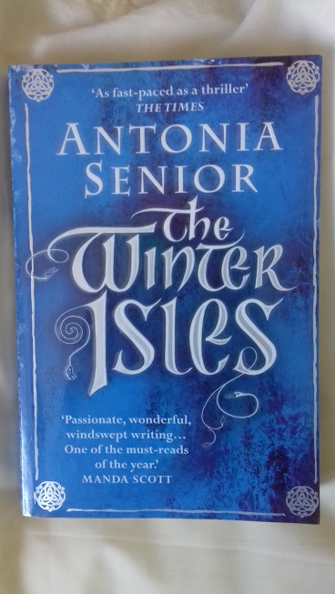
The simple but striking cover

Example: The Winter Isles by Antonia Senior
Sometimes a publisher will avoid all of the above options and go with something basic and neutral. This makes it difficult to judge the book by the cover and to decide at a glance whether it’s something you want to read or not, but the advantage is that it’s not immediately off-putting to readers. (If you’re wondering, I’m reading The Winter Isles now, so haven’t posted my thoughts yet!)
~
What do you think of the covers pictured above? Would they make you more or less likely to pick up the book?
 While I was reading The Bedlam Stacks by Natasha Pulley a few weeks ago, it occurred to me that I have read very few books set in South America, historical or otherwise. The Bedlam Stacks involves a mission to 1860s Peru in search of quinine and is the only book about Peru I can remember reading. And it’s not just Peru, because Ecuador, Venezuela, Chile, Argentina, Bolivia and all the other countries that make up South America have also featured rarely or not at all in my reading.
 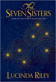 A quick search of the historical fiction reviews on my blog brings up only one result: The Seven Sisters by Lucinda Riley, which tells the story of a young woman who lived in Rio de Janeiro during the 1920s and played a part in the creation of the statue of Christ the Redeemer. Expanding the search to include reviews of any genre, I also found Little Black Lies, a crime novel by Sharon Bolton set in the Falkland Islands, and Three Singles to Adventure, Gerald Durrell’s account of an animal-collecting expedition to Guyana. And that’s all. I can’t think of many examples from my pre-blogging days either, so clearly there’s a big gap in my reading that needs to be filled!