
This week’s topic for Top Ten Tuesday (hosted by That Artsy Reader Girl) is: “Book Covers Featuring Cool/Pretty/Unique/etc Typography“.
I thought I would struggle with this, but actually the only difficulty was narrowing the options down to ten. I think all of the books below have interesting typography – I hope you agree! My reviews are linked if you want to find out more about any of these titles.
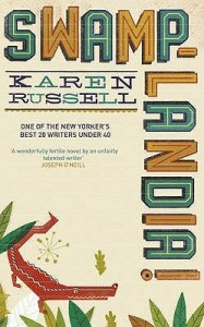

1. Swamplandia! by Karen Russell
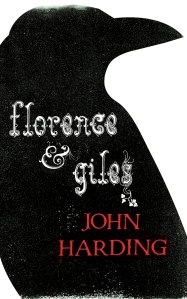
2. Florence & Giles by John Harding
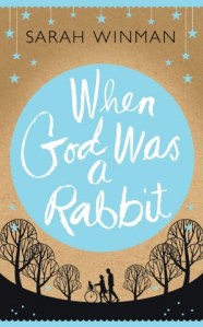
3. When God was a Rabbit by Sarah Winman
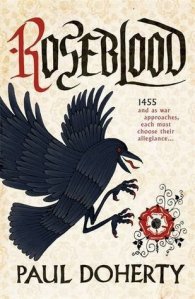
4. Roseblood by Paul Doherty
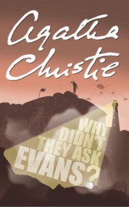
5. Why Didn’t They Ask Evans? by Agatha Christie
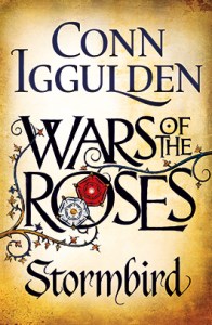
6. Stormbird by Conn Iggulden
7. The Testament of Gideon Mack by James Robertson
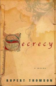
8. Secrecy by Rupert Thomson
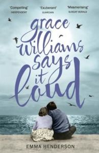
9. Grace Williams Says It Loud by Emma Henderson
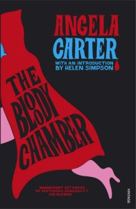
10. The Bloody Chamber by Angela Carter
~
Have you read any of these books? Which of these covers do you think has the best typography?

The Angela Carter and Agatha Christie make a good pairing. Some great choices.
Thanks. Yes, those two do make a good pair – I hadn’t noticed that!
Love these! Stormbird especially. I’ve always loved that cover 🙂
Yes, it’s a great cover!
This makes me feel like unusual typography is a bit of a gamble – some of these look very amateur to me (e.g. the John Harding) while others are fantastic (the Karen Russell and James Robertson, both of which I’ve read and enjoyed!)
Yes, sometimes it looks good and sometimes it doesn’t. I tried to include a mixture of different types here. I’m glad you enjoyed the Karen Russell and James Robertson – I thought they were both fascinating books.
Here we have an example of packaging across the pond. I have read Swamplandia, Storm Bird, Why Didn’t They Ask Evans, and The Bloody Chamber. None of the covers I saw looked like these except Storm Bird, which probably came from the U. K.
I don’t know if this will work, but I’m trying to copy in my cover for Swamplandia so you can see. Nope. Here’s the link: Day 404: Swamplandia! – What? Me Read?
These are very striking covers, though.
Swamplandia now seems to have a new cover here in the UK – the cover I used in this post is from 2011, when I read and reviewed it – but you’re right, neither of them is the same as yours.
I like the one I have, but it doesn’t really have unusual typography.
I like all of these, especially Storm Bird:The Wars of the Roses (I also have that book, but haven’t read it yet), and When God was a Rabbit.
I hope you enjoy Storm Bird whenever you read it. The Wars of the Roses is one of my favourite historical periods to read about, so I found it interesting, but I still haven’t continued with the rest of the series.
I have a copy of the Carter with that enigmatic cover, and of course all the officially sanctioned Christie titles have the Christie ‘autograph’ logo, don’t they? Cover designs with a corvid image somewhere always attract my eye, regardless of typography!
Yes, corvid covers are always eye-catching. I wonder if I could have found ten – maybe an idea for a future TTT post!
You found so many samples of different typography! I love it. Stormbird is especially cool, but I also really like Grace Williams Says it Loud. 😀
I tried to include a good variety. The Stormbird and Grace Williams covers are two of my favourites – I’m glad you like them too!
Ooh great choices. I love how the first one uses the corner, definitely a memorable way to display the title. War Of The Roses looks so pretty with the rose symbols centered in the O. I also especially love the font on Roseblood and love how some titles use different ones in such complimentary ways. I havent read it yet but really want to pick up The Bloody Chamber fairly soon.
I’m glad you like my choices! Yes, it’s unusual to see a cover like the Swamplandia one which uses the corner. I hope you like the Angela Carter book! I tried to read one of her novels years ago and struggled to get into it, but I did enjoy some of the short stories in The Bloody Chamber.
Thanks, I’ll have to let you know how it goes. Im sorry yer full length novels didnt work for you though.